Wednesday, September 28, 2016

Momentum Rotation System AmiBroker Code

I've received several requests for details on the AmiBroker (AB) code and settings used for the backtest shown in my April post: Momentum Rotation 60 Day ROC System Results. That post used the AmiBroker Formula Language (AFL) code from my article in March 2015.  That was a long time ago, so here is the 60 day momentum rotation system AFL again:
SetBacktestMode( backtestRotational );

// 1 ###### BACKTESTER SETTINGS - 1. GENERAL TAB
SetOption("InitialEquity", 100000);
SetOption("MinShares", 1);
SetOption("MinPosValue", 0);
SetOption("FuturesMode", False);
SetOption("AllowPositionShrinking", False);
SetOption("ActivateStopsImmediately", False);
SetOption("ReverseSignalForcesExit", False);
SetOption("AllowSameBarExit", False);
RoundLotSize = 0;
TickSize = 0;
MarginDeposit = 0;
PointValue = 1;
SetOption("CommissionMode", 2);
SetOption("CommissionAmount", 7.95);
SetOption("InterestRate", 0);
SetOption("AccountMargin", 100);
SetOption("MarginRequirement", 100);

// 2 ###### BACKTESTER SETTINGS - 2. TRADES TAB
BuyPrice = SellPrice = ShortPrice = CoverPrice = Close;
SetTradeDelays( 1, 1, 1, 1);

// 5 ###### BACKTESTER SETTINGS - 5. PORTFOLIO TAB
//SetOption("MaxOpenPositions", 1);
// check the box to "Add artificial future bar..."
// Limit trade size as % - use 10 for live trading
// check the box to "Disable trade size limit..."
SetOption("UsePrevBarEquityForPosSizing", False);
SetOption("UseCustomBacktestProc", False);

// 6 ###### BACKTESTER SETTINGS - 6. WALK FORWARD TAB
//SetOption("WorstRankHeld", 1);


Totalpositions = 1;
SetOption("WorstRankHeld", 1);
SetOption("MaxOpenPositions", Totalpositions );
PositionSize = -100 / Totalpositions ;

LastDayOfMonth = IIf( (Month() == Ref( Month(), 1) AND (Month() != Ref( Month(), 2)) ), 1, 0);
TradeDay = LastDayOfMonth ;

Score = ROC(Close, 60);
PositionScore = IIf(Score < 0, 0, Score ); // Long only
PositionScore = IIf(TradeDay , PositionScore , scoreNoRotate);

//Exploration
Filter = 1;
AddColumn(Score ,"Score",1.1);
AddColumn(PositionScore ,"PositionScore ",1.1);
AddColumn(PositionSize ,"Position Size",1.1);
You can download the AFL code above from my Google Drive: 00_60DayMomentum.afl

It is fairly straight forward AFL code, but I've highlighted four key areas:
  • Line 1 - Rotational trading needs to be activated for this system
  • Line 24 - Trade delays are set to 1, which means trades are entered one day after the signal is generated
  • Line 43 - The LastDayOfMonth variable actually stores the second to last day of the month.  This causes the rotation ranking signal to be calculated on the second to last day of the month.  Since our trade delay is one, the trade occurs the following day, the last day of the month
  • Line 47 - If the ROC(60) is negative, then the PositionScore is set to 0, otherwise the PositionScore is set to the ROC(60)

On the second to last trading day of the month, this strategy calculates the 60 day ROC for each product in the portfolio based on closing prices on that day.  If the 60 day ROC is negative, the system sets the PositionScore to 0 for that product.  It then ranks all of the products in the portfolio, selecting the product with the highest rank.  If all products have a rank of 0, the system will move to cash.  On the last trading day of the month, it executes the buy and sell orders at the close - "market on close" orders in live trading.

In addition to the AFL code above, I used the AB settings shown below.  To replicate my results, you'll need to update your AB settings to match mine.

AmiBroker Backtester Settings - General Tab
AmiBroker Backtester Settings General Tab
(click to enlarge)

AmiBroker Backtester Settings - Trades Tab
AmiBroker Backtester Settings Trades Tab
(click to enlarge)

AmiBroker Backtester Settings - Stops Tab
AmiBroker Backtester Settings Stops Tab
(click to enlarge)

AmiBroker Backtester Settings - Report Tab
AmiBroker Backtester Settings Report Tab
(click to enlarge)

AmiBroker Backtester Settings - Portfolio Tab
AmiBroker Backtester Settings Portfolio Tab
(click to enlarge)

AmiBroker Backtester Settings - Walk Forward Tab
AmiBroker Backtester Settings Walk Forward Tab
(click to enlarge)

AmiBroker Backtester Settings - Monte Carlo Tab
AmiBroker Backtester Settings Monte Carlo Tab
(click to enlarge)

AmiBroker Backtester Filter Settings
(click to enlarge)

To run my AFL in your installation of AmiBroker:
  • Download my AFL file
  • Open an AB Analysis tab
  • Select my AFL file in the Formula field on the Analysis tab
  • Update the filter settings (shown above) to only run this strategy against a specific Watch List
  • Change the range to "From-To dates", and then select a date range
  • Finally, select the Backtest button to run the strategy

After you have backtesting configured and running, the next step is to automate quote updates and signal generation.  I use the Windows Task Scheduler utility to call JS scripts, that in turn launch AB and AmiQuote.  This topic is beyond the scope of this article, but I may discuss it in the future.

Also, since my last blog post, there have been several articles on momentum trading, and the poor performance of these systems lately.  Here are a few worth reading:


Follow my blog by email, RSS feed or Twitter (@DTRTrading).  All options are available on the top of the right hand navigation column under the headings "Subscribe To RSS Feed", "Follow By Email", and "Twitter". 

Thursday, July 14, 2016

Momentum Rotation Multiple System Results

In the last two posts (here and here) we looked at the performance of a simple 60 day momentum rotation system. In this post, we will look at variations on that simple system, and how these variations performed during the same time period, using the same 10 ETF products.  The 10 ETFs used by all of the systems were:

Recall that our simple momentum rotation system only looked at the 60 day/period momentum (ROC) for ranking, and picked the one ETF with the largest positive change.  If all 10 of the ETFs in the group had a negative rate of change...a price today that was lower than the price 60 days ago, then the system moved to cash.  The system only ranked the ETFs in the portfolio on the last trading day of the month.  This is how the system shown in the past posts was structured.  The associated AmiBroker afl code can be found here.

In this post, we will look at six versions of this simple system:
  1. 20 period momentum rotation ( ROC(20) )
  2. 60 period momentum rotation ( ROC(60) )
  3. 120 period momentum rotation ( ROC(120) )
  4. 20 period / 120 period momentum rotation ( ROC(20) + ROC(120) )
  5. 20 period / 120 period smoothed momentum rotation ( ROC(20) + MA(ROC(120), 20) ) 
  6. Weighted momentum rotation ( 0.5*ROC(120) + 0.3*ROC(20) + 0.2*HV(120) )

We will review four variations of each of these six systems, and compare their performance to that of our "standard" 60 period momentum rotation system reviewed in my previous articles.  There are six equity curve charts below, one for each of the six versions listed above.  Each equity curve chart contains the following four variations:
  1. No Ftr (No Filter - NF) - select the ETF that has the greatest ROC of the 10 ETFs; positive momentum or the smallest negative momentum (green)
  2. Slope Ftr (Slope Filter - SF) - select the ETF that has the greatest positive ROC of the 10 ETFs; do not select any ETF if all 10 ETFs have negative ROC -> go to cash (blue)
  3. Brdth Ftr (Breadth Filter - BF) - select the ETF that has the greatest ROC of the 10 ETFs; positive momentum or the smallest negative momentum; if the breadth filter (based on 200 funds) is below a threshold value -> go to cash (gold)
  4. Markt Ftr (Market Filter - MA) - select the ETF that has the greatest ROC of the 10 ETFs; positive momentum or the smallest negative momentum; if the S&P 500 is below the 200 day MA on the S&P 500 -> go to cash (purple)

In addition, each of the six equity curve charts contains the equity curves for two additional systems:
  • Standard - our standard 60 period momentum rotation system with slope filter; no trades taken with negative momentum (red)
  • S&P 500 Index - buy and hold the S&P 500 (orange)

Now let's look at the equity curves for each of the six system variations...

20 Period Momentum ( ROC(20) )
(click to enlarge)
The four systems (No Ftr, Slope Ftr, Brdth Ftr, Mrkt Ftr) use as their core, a momentum system based on the 20 period rate of change (ROC(20)).  The "standard" 60 period momentum system (red) had the greatest overall return, and the four 20 period variations returned about the same as buying and holding the S&P 500 (orange).


60 Period Momentum ( ROC(60) )
(click to enlarge)
In the equity curve chart above, the red curve is the same as the blue curve; the "standard" system is the same as the 60 period system with the slope filter.  Our "standard" system had the lowest overall performance of the 60 period systems, although they all performed better than buy and hold (orange).  The best performance went to the non-filtered system variation (green).


120 Period Momentum ( ROC(120) )
(click to enlarge)
Other than the market filter variation (purple), the other three 120 period variations seem to be recovering from the 2015 performance lull fairly well.  The best performance went to the non-filtered system variation (green).  The "standard" system (red) under performed all 120 period variations.


ROC(20) + ROC(120)
(click to enlarge)
These four variations added the 20 period momentum to the 120 period momentum, yielding a composite momentum score.  The best performance again went to the non-filtered variation, with the breadth filter variation coming in second place.  All variations out performed buy and hold.


ROC(20) + MA(ROC(120), 20)
(click to enlarge)
These four variations added the 20 period momentum to the 20 period moving average of the 120 period momentum.  These variations respond more slowly to the change in the 120 period momentum.  We see the impact of this change on the steep decline in system performance in 2015.  All variations again out performed buy and hold.


Weighted System Components (3)
(click to enlarge)
Lastly, we look at four variations that are based on summing three weighted scores.  These four variations add the 120 period momentum (multiplied by 0.5) with the 20 period momentum (multiplied by 0.3) with the 120 period historical volatility (multiplied by 0.2).  The best performance went to the non-filtered variation, followed by the breadth filter variation.

For me, there were two big take-aways in reviewing these equity curves.  One, all versions and variations experienced poor performance in 2015.  Second, the non-filtered variations, in general, outperformed the other variations.  These same two trends were present in nearly all of the other 30+ product portfolios I tested with these systems.

Finally, I thought it was interesting that just this week the following article was published via Quantpedia: Has Momentum Lost Its Momentum?

In the next post, I will share the AmiBroker system settings that I used for these tests, so that you can replicate the "standard" system results.


Follow my blog by email, RSS feed or Twitter (@DTRTrading).  All options are available on the top of the right hand navigation column under the headings "Subscribe To RSS Feed", "Follow By Email", and "Twitter". 

Wednesday, July 6, 2016

Momentum Rotation 60 Day ROC System Metrics

It's been a while since my last post.  I had planned on writing this particular article about three months ago, but work got in the way of my writing and testing  Over the next few weeks I will try to close out this series on momentum rotation using my 60 day ROC example written for AmiBroker.  After I finish this series, I will get back to option strategy backtesting

I thought it was interesting how poorly the 60 day ROC momentum rotation system performed during 2015.  During this period, there were no consistent uptrends for the products traded by my example system.  I believe this was the primary reason for the poor performance.  I thought this might be reflected in the 250 day correlation between the products (measured at the end of each year in the test period).  The correlation tables are shown below.  Surprisingly, 2015 did not look dramatically different than some of the other years.

2003 - 250 Day Correlation
2003 250 day correlation between ETFs: EEM, EFA, FXI, IEF, IYR, SHY, SPY, TIP, UUP, and XLV
(click to enlarge)
2004 - 250 Day Correlation
2004 250 day correlation between ETFs: EEM, EFA, FXI, IEF, IYR, SHY, SPY, TIP, UUP, and XLV
(click to enlarge)
2005 - 250 Day Correlation
2005 250 day correlation between ETFs: EEM, EFA, FXI, IEF, IYR, SHY, SPY, TIP, UUP, and XLV
(click to enlarge)
2006 - 250 Day Correlation
2006 250 day correlation between ETFs: EEM, EFA, FXI, IEF, IYR, SHY, SPY, TIP, UUP, and XLV
(click to enlarge)
2007 - 250 Day Correlation
2007 250 day correlation between ETFs: EEM, EFA, FXI, IEF, IYR, SHY, SPY, TIP, UUP, and XLV
(click to enlarge)
2008 - 250 Day Correlation
2008 250 day correlation between ETFs: EEM, EFA, FXI, IEF, IYR, SHY, SPY, TIP, UUP, and XLV
(click to enlarge)
2009 - 250 Day Correlation
2009 250 day correlation between ETFs: EEM, EFA, FXI, IEF, IYR, SHY, SPY, TIP, UUP, and XLV
(click to enlarge)
2010 - 250 Day Correlation
2010 250 day correlation between ETFs: EEM, EFA, FXI, IEF, IYR, SHY, SPY, TIP, UUP, and XLV
(click to enlarge)
2011 - 250 Day Correlation
2011 250 day correlation between ETFs: EEM, EFA, FXI, IEF, IYR, SHY, SPY, TIP, UUP, and XLV
(click to enlarge)
2012 - 250 Day Correlation
2012 250 day correlation between ETFs: EEM, EFA, FXI, IEF, IYR, SHY, SPY, TIP, UUP, and XLV
(click to enlarge)
2013 - 250 Day Correlation
2013 250 day correlation between ETFs: EEM, EFA, FXI, IEF, IYR, SHY, SPY, TIP, UUP, and XLV
(click to enlarge)
2014 - 250 Day Correlation
2014 250 day correlation between ETFs: EEM, EFA, FXI, IEF, IYR, SHY, SPY, TIP, UUP, and XLV
(click to enlarge)
2015 - 250 Day Correlation
2015 250 day correlation between ETFs: EEM, EFA, FXI, IEF, IYR, SHY, SPY, TIP, UUP, and XLV
(click to enlarge)
2016 - 250 Day Correlation
2016 250 day correlation between ETFs: EEM, EFA, FXI, IEF, IYR, SHY, SPY, TIP, UUP, and XLV
(click to enlarge)

Next, I looked at the performance of this system from: 1) 2003 through 2014, 2) 2015 through the first three months of 2016, and 3) 2003 through the first three months of 2016.  These metrics are shown in the table below.

60 day momentum rotation system metrics for different yearly periods
(click to enlarge)

For 2015, there were a few metrics that jumped out at me compared to the 2003 through 2014 period:
  1. The win rate was much lower, so fewer winning trades than typical for this system
  2. The average bars held was higher for both winners and losers, so we were in the trades longer than usual before a momentum change occurred
  3. The maximum consecutive winners and losers was lower, indicating a market with no sectors with strong upward momentum...a zig zagging market
  4. The maximum trade drawdown was lower, indicating no persistent down moves before a trade was exited...weak uptrends and weak downtrends

I also reviewed Monte Carlo simulations for this system (using the same ETF products) from 2003 through 2016.  For the Monte Carlo runs, the position sizing utilized 99% of the available capital for each trade.
Equity curves for 1000 Monte Carlo simulations (2003 - 2016) for the 60 day momentum rotation system
(click to enlarge)

The actual metrics for this simulation are shown in the table below.  The backtesting and Monte Carlo simulations assumed an initial portfolio equity of $100K.

Metrics for 1000 Monte Carlo simulations (2003 - 2016) for the 60 day momentum rotation system
(click to enlarge)

90% of the observed annual return values were at or above 9.86%.  Also in 90% of cases the drawdown was less than or equal to 31.84%.  A negative return for the system should occur in less than 1% of the cases based on the data above.  For the actual bactested system, the annual return was 16.9%.  Even when I performed the simulations with a fixed number of shares per trade, rather than 99% of the portfolio equity, there were no negative annual return values in the Monte Carlo metrics tables.  Using a fixed number of shares per trade eliminates the compounding effect.

In the next article I will show the equity curves for several other momentum rotation systems trading the same products.  Do you think they will also perform poorly during 2015?


Follow my blog by email, RSS feed or Twitter (@DTRTrading).  All options are available on the top of the right hand navigation column under the headings "Subscribe To RSS Feed", "Follow By Email", and "Twitter". 

Monday, April 11, 2016

Momentum Rotation 60 Day ROC System Results

In my last post, Yahoo Data and Momentum Rotation - Analysis of 2015 Data, the big take away was the importance of performing a full download / update of historical data before generating your signals.  This is particularly important when using dividend adjusted data, which is typical for most equities and ETFs.  The dividend adjustments need to be reflected in the entire series for a particular product, not just the most recent few months.

In this post we will look at the current performance of a momentum rotation system for AmiBroker that I showed in an earlier post here.  This momentum rotation system ranks a portfolio of products based on their 60 day rate of change.  The product with the largest positive change in the portfolio is selected for entry.  If all of the products in the portfolio have a negative rate of change...a price today that is lower than the price 60 trading days ago, then the system will move to cash.  The system runs on the last trading day of the month, and executes orders at the close - "market on close" orders in live trading.

This momentum rotation system was run against the products listed below in the March 2015 post.  We will use the same products for this post.

So how has this momentum rotation system performed since last March?  Pretty poorly!  March of 2015 was the high water mark for this system's equity curve.  Since that time, the equity curve has dropped 23.82%.

60 Day Momentum Rotation System Equity Curve 2003 - 2016
(click to enlarge)

60 Day Momentum Rotation System Profit Table 2003 - 2016
(click to enlarge)

The ETFs held by date are shown in the chart below.  Early in the life of this system, it was not uncommon to hold the same ETF for several months.  Trade duration has shortened in last few years.

60 Day Momentum Rotation System - Positions By Date - 2003 - 2016
(click to enlarge)

The score for each ETF by date can be downloaded from Google Docs: Rank By Date.  Note that the score is calculated based on the closing prices the day before the last trading day of the month.  This score is then used to rank the ETSs and determine the trade for the last day of the month (using a market on close order).

The trade log for this system can be downloaded from Google Docs: Trade Log

In my next post, I will review some metrics for this system and how they have changed over the years.


Follow my blog by email, RSS feed or Twitter (@DTRTrading).  All options are available on the top of the right hand navigation column under the headings "Subscribe To RSS Feed", "Follow By Email", and "Twitter".

Monday, April 4, 2016

Yahoo Data and Momentum Rotation - Analysis of 2015 Data

I've taken a bit of a break from posting options strategy research, but before I dive back in I'm going to revisit some material I posted on Momentum Rotation systems last year.

If you're new to my blog you may have missed my posts related to rotation system results and data.  For the last several years, I have been trading monthly Momentum Rotation strategies across six accounts.  These strategies rank portfolios containing between 10 and 30 ETFs or mutual funds by momentum.  Some of my strategies combine multiple momentum readings to derive a rank, while others go further and add filters.  All of my rotation strategies rank a basket of funds relative to each other...and this is a common approach across all Momentum Rotation systems, not just mine.

I use AmiBroker and Yahoo! end-of-data data (Yahoo Data Info 1, Yahoo Data Info 2) for my rotation strategies.  A few years ago I began to realize that the signals I was receiving (and trading on!) from my rotation strategies were occasionally inconsistent with the backtests of these same strategies.  I didn't spend much time digging into the issue at the time, but it remained in the back of my mind.

In August 2014, I decided to backtest my live rotation strategies across the same period that I had actively traded with these same rotation strategies.  I found that a number of the trades in the backtests did not match the trades I had actually executed and recorded in my spreadsheets.

I initially thought the issue was caused by using dividend adjusted data rather than actual data, but in my last Momentum Rotation post (here) I realized this was not the issue.  Dividend adjusted data does result in stable Momentum Rotation rankings as dividends are issued.  I also analyzed several ETFs to determine if their ROC values were stable across dividend issuance, and they were.

Based on these findings and some advice from Cesar Alvarez, I started taking taking snapshots of my AmiBroker database at the end of each month beginning in March of 2015.  I continued taking database snapshots through January of 2016...11 months in total.  Planning to get to the bottom of the mismatch between the actual signals and the backtest signals, I ran backtests of my live systems across each database snapshot and compared these signals with the signals I actually traded.  Surprisingly, there was no difference ... the backtest signals from all 11 database snapshots matched my live signals during those same periods.

What changed during those 11 months compared to the time prior to March of 2015?  Well, I had made one small change...so I thought!  Prior to March, 2015 I did not perform complete historical data updates very often...and I would typically only update the last several months of historical data when I did perform an update...and this was a big mistake that I did not recognize!

Beginning in March, 2015 I started performing complete database updates on the 25th of each month.  With these updates, I re-downloaded all of my historical data from January 1st, 1900 to the present.  This corrected my signal instability problem.  The lack of complete historical updates had been a big mistake on my part and resulted in my backtest signals not matching the signals I had actually traded.

The big take away ... if you're not already doing this ... perform a complete historical data update prior to generating your live trading signals.  If your data is dividend and split adjusted, you need to update the entire series...pretty obvious now, but something I missed...hopefully others will learn from my mistake!

In my next post, I will review the 2015 results of the Momentum Rotation system that I shared in March 2015 (here).

Lastly, I just started reading Momo Traders (full disclosure, Brady Dahl sent me a copy) and it reminds me of the Market Wizards series.  I'm only on the first interview, so no book review yet, but I am enjoying it so far.


Follow my blog by email, RSS feed or Twitter (@DTRTrading).  All options are available on the top of the right hand navigation column under the headings "Subscribe To RSS Feed", "Follow By Email", and "Twitter". 

Wednesday, February 3, 2016

SPX Straddle - Normalized Return Charts

The last article on RUT straddles (here) was very popular, so I thought I'd write a similar post on SPX straddles.  Recall that from September, 2015 through November, 2015 I reviewed the backtest results form 28,840 short options straddles on the S&P 500 Index (SPX).  You can read the summary articles from that SPX series here and here, and the introductory article for the straddle series here.

In this post, I am going to show the P&L results for the SPX straddle in line-chart form similar to the last article.  The data in the charts below is only for the non-IVR filtered trades.  The first set of charts shows the P&L Per Day amounts, with each chart representing the results for trades started at the same days-to-expiration (DTE).  Here are a few key points for each chart:
  • Each colored line in a chart represents a particular profit taking percentage level in terms of the credit received
  • The X-axis displays the loss taking percentage level in terms of the credit received
  • The Y-axis displays the average normalized percent P&L per day
  • The Y-axis scale is the same for all the P&L per day charts in this article

It's important to note that these returns are the average normalized returns per day.  This is important when comparing options strategies for the following reasons:
  • Each data point in each of the seven P&L per day charts had different average trade durations.  One data point may have had an average of 15 days-in-trade (DIT), while another may have had an average of 60 DIT.  With most of these strategy variations, there were approximately 100 trades entered for each data point in the charts below.  100 times 15 is 1500 total DIT for a strategy, while 100 times 60 yields a total of 6000 DIT.  The number of DIT obviously impacts the average P&L per day.
  • When a straddle is entered at 38 DTE its initial portfolio margin (PM) requirement is going to be greater than say a straddle entered at 80 DTE.  The difference in margin requirement can be nearly 20% greater in this example.  This initial PM number must be taken into account in order to fairly compare P&L per day values...and has been in the charts below.  Using dollar amounts instead of average normalized P&L per day would not necessarily take into account the different margin requirements for the different DTE variations.

Now, on to the charts...

38 DTE
38 DTE SPX Short Straddle Summary Normalized Percent P&L Per Day Graph
(click to enlarge)
Unlike the 38 DTE RUT straddles, the 38 DTE SPX straddles have a larger range in P&L per day numbers.  There is a greater distance between each of the profit taking lines in the chart above, rather than the overlapping of the same lines for the RUT chart.  Similar to the RUT, if you want to maximize your P&L per day, you should take profits at 10% and losses at 25%.  These readings drop off as you increase your loss levels from 25%, to 50%, to 75%...there is a rebound in P&L per days readings at the two loss levels greater than 75%.  Also note that most of the P&L per day readings on the 38 DTE SPX straddle are greater than the corresponding readings on the 38 DTE RUT straddle.

45 DTE
45 DTE SPX Short Straddle Summary Normalized Percent P&L Per Day Graph
(click to enlarge)
For the 45 DTE SPX straddle, the returns per day are maximized at the 125% and 150% loss taking levels.  The 25% profit taking level had the greatest returns followed by the 35% profit taking level.  Recall that for the 45 DTE RUT straddle, the top performer was the 10% profit taking level, with losses taken at 75%.

52 DTE
52 DTE SPX Short Straddle Summary Normalized Percent P&L Per Day Graph
(click to enlarge)
At 52 DTE, the P&L per day readings are fairly consistent for each of the profit taking levels...with a slight downward slope as the loss taking levels are increased.  Taking losses larger than 25% doesn't pay off at 52 DTE.  At the 25% loss taking level, P&L per day readings were maximized at the 45% profit taking level...although the 35% and 25% profit taking levels were not far behind.  The 45% profit taking level was the clear winner for the 52 DTE RUT straddles as well...with the 25% loss taking level also being the clear winner for the RUT.

59 DTE
59 DTE SPX Short Straddle Summary Normalized Percent P&L Per Day Graph
(click to enlarge)
At 59 DTE, the SPX straddle profit taking lines look very similar to those for the RUT straddle...with P&L per day levels maximized with loss taking at 75%.  To maximize your P&L per day at 59 DTE, take profits at 25% and losses at 75% for both the RUT and SPX straddles.  Your returns per day drop after the 75% loss taking level, so no reason to let your losses get any larger than 75% for the 59 DTE straddle.

66 DTE
66 DTE SPX Short Straddle Summary Normalized Percent P&L Per Day Graph
(click to enlarge)
There's no reason to let your losses get any larger than 25% for the 66 DTE SPX straddle.  Additionally, most of the profit taking lines are bunched together at the 25% loss taking level, so a lower profit taking % is appropriate.  Taking profits at 25% and losses at 25% makes the most sense for the 66 DTE SPX straddle.  The 66 DTE RUT straddle on the other hand had clear performance peaks at the 75% loss level.

73 DTE
73 DTE SPX Short Straddle Summary Normalized Percent P&L Per Day Graph
(click to enlarge)
At 73 DTE, taking losses at 75% has a clear benefit for most of the profit taking levels, except for the 10% profit taking level.  The 35% and 45% profit taking levels were the winners with the loss taking at 75%.  If you're taking losses at 25%, then the 10% profit taking level is superior.  The 73 DTE RUT and SPX straddles both had the profit taking level of 10% showing the strongest performance at the 25% loss level.  Considering both DIT and win rate, I would be inclined to trade the 73 DTE variation with profit taking at 10% and loss taking at 25%.


80 DTE
80 DTE SPX Short Straddle Summary Normalized Percent P&L Per Day Graph
(click to enlarge)
The 10% profit taking level outperformed the other profit taking levels at the 25% and 50% loss levels.  The strongest overall performer was profit taking at 45% with a loss level of 100%.

----

The next set of charts contains the average normalized P&L per trade for the seven different DTE reviewed in my SPX straddle backtest series.  The different initial PM requirements were used when calculating the P&L per trade numbers similar to how the PM was used in calculating the P&L per day numbers.  Also, as above, the next seven charts use the same Y-axis scale.

38 DTE
38 DTE SPX Short Straddle Summary Normalized Percent P&L Per Trade Graph
(click to enlarge)
At 38 DTE, the P&L per trade lines were fairly flat across loss taking levels, so not a huge benefit in carrying trades beyond the 25% loss taking level.  The top performer took profits at 35% and losses at 25%.  For a given profit taking level, the lowest per trade returns seemed to coincide with the 75% loss taking level.

45 DTE
45 DTE SPX Short Straddle Summary Normalized Percent P&L Per Trade Graph
(click to enlarge)
At 45 DTE, per trade returns were maximized at the 125% loss taking level, regardless of the profit taking level.  The top performer took profits at 35% and losses at 125%.  The 25% profit taking level was a close second.  We did not see this pattern on the 45 DTE RUT straddle.

52 DTE
52 DTE SPX Short Straddle Summary Normalized Percent P&L Per Trade Graph
(click to enlarge)
There is a strong similarity between the RUT and SPX straddle charts at 52 DTE.  With both, the 45% profit taking line had the greatest returns per trade.  For the RUT, you should limit your largest loss to 50%, while with the SPX the limit should be at the 75% loss level.

59 DTE
59 DTE SPX Short Straddle Summary Normalized Percent P&L Per Trade Graph
(click to enlarge)
At 59 DTE, P&L per trade was maximized at the 75% loss taking level.  The greatest returns again occurred with the 45% profit taking level, with the highest per trade return being just under 30%.  The RUT and SPX straddle charts look very similar at 59 DTE.

66 DTE
66 DTE SPX Short Straddle Summary Normalized Percent P&L Per Trade Graph
(click to enlarge)
At 66 DTE, you can detect a slight upward drift in most of the profit taking lines in the chart.  There is a clear transition at the 75% loss taking level, but it is hard to ignore the solid returns at the 25% loss taking level.

73 DTE
73 DTE SPX Short Straddle Summary Normalized Percent P&L Per Trade Graph
(click to enlarge)
At 73 DTE, there is a huge increase in P&L per trade by letting losses run to 75%...but no real benefit in letting your losses exceed this amount.  The top performer took profits at 45% and losses at 125%...although the 125% loss level did not deliver returns that much greater than the 75% loss taking level.

80 DTE
80 DTE SPX Short Straddle Summary Normalized Percent P&L Per Trade Graph
(click to enlarge)
At 80 DTE, the P&L per trade was maximized at the 100% loss taking level for all of the profit taking lines except for the 10% profit taking line.  The 10% profit taking level showed maximum per trade returns at the 50% loss taking level, although the returns at the 50% loss taking level are not much greater than at the 25% loss taking level.

For most of the charts, the 10% profit taking level and the 25% loss taking level almost always yielded a return of approximately 5% on the PM requirement...and the PM requirement becomes smaller as we move out in DTE.  We noticed this same pattern with the RUT straddles.  Additionally, at 73 DTE and 80 DTE the 10% profit taking level and 25% loss taking level yielded returns of approximately 10% per trade.

As we noted for the RUT straddles, 5% at 38 DTE is going to be a greater dollar amount than 5% at 80 DTE.  I continue to think that the data around the 10% profit taking level is very interesting.

When we consider profit taking targets we need to consider how these targets impact DIT.  Here are a few approximations that seem to hold with both the SPX and RUT straddles:
  • The 10% profit taking level will have your DIT at approximately 30% of DTE
  • The 25% profit taking level will have your DIT at approximately 60% of DTE
  • The 35% profit taking level will have your DIT at approximately 70% of DTE
  • The 45% profit taking level will have your DIT at approximately 80% of DTE

Don't forget, that as the profit taking level is increased, the win rate drops.  See my SPX Straddle Summary Page for links to all of the articles in the series.  Lastly, over the next several days I will tweet (@DTRTrading) win rate line-charts and DIT line-charts, similar to those above.


Follow my blog by email, RSS feed or Twitter (@DTRTrading).  All options are available on the top of the right hand navigation column under the headings "Subscribe To RSS Feed", "Follow By Email", and "Twitter". 

Tuesday, January 26, 2016

RUT Straddle - Normalized Return Charts

In the last two articles (here and here), we reviewed the backtest results of 28,840 short options straddles on the Russell 2000 Index (RUT).  If you haven't read the last two articles, you may want to first read the introductory article for this series Option Straddle Series - P&L Exits.

In this post, I am going to show the P&L results in line-chart form rather than the heat map tables I used in the last articles.  The data in the charts below is only for the non-IVR filtered trades.  The first set of charts shows the P&L Per Day amounts, with each chart representing the results for trades started at the same days to expiration (DTE).  Here are a few key points for each chart:
  • Each colored line in a chart represents a particular profit taking percentage level in terms of the credit received
  • The X-axis displays the loss taking percentage level in terms of the credit received
  • The Y-axis displays the average normalized percent P&L per day
  • The Y-axis scale is the same for all the P&L per day charts in this article

Before we go further, I want to reiterate that these returns are the average normalized returns per day.  What does this mean?  Here are a few points to consider, and that I considered, when calculating these P&L numbers:
  • Each data point in each of the seven P&L per day charts had different average trade durations.  One data point may have had an average of 15 DIT, while another may have had an average of 60 DIT.  With most of these strategy variations, there were approximately 100 trades entered for each data point in the charts below.  100 times 15 is 1500 total DIT for a strategy, while 100 times 60 yields a total of 6000 DIT.  The number of DIT obviously impacts the average P&L per day.
  • When a straddle is entered at 38 DTE its initial portfolio margin (PM) requirement is going to be greater than say a straddle entered at 80 DTE.  The difference in margin requirement can be nearly 20% greater in this example.  This initial PM number must be taken into account in order to fairly compare P&L per day values...and has been in the charts below.  Using dollar amounts instead of average normalized P&L per day would not necessarily take into account the different margin requirements for the different DTE variations.

With that background information finished, let's dive into the charts...

38 DTE
38 DTE RUT Short Straddle Summary Normalized Percent P&L Per Day Graph
(click to enlarge)
A couple of patterns stand out here.  The first is that if you want to maximize your P&L per day at 38 DTE, you should take your profits at 10% and losses at 25%...diminishing returns after that loss level.  That loss level also seems to be the best for the other profit taking levels at 38 DTE.

45 DTE
45 DTE RUT Short Straddle Summary Normalized Percent P&L Per Day Graph
(click to enlarge)
At 45 DTE, you can maximize your P&L per day by sticking with the 10% profit taking level.  The P&L per day numbers increase as we increase our loss taking level from 25%, to 50%, to 75%, with a peak clearly present at 75%.  Taking larger losses than 75% doesn't make sense at 45 DTE.

52 DTE
52 DTE RUT Short Straddle Summary Normalized Percent P&L Per Day Graph
(click to enlarge)
At 52 DTE, it doesn't make much sense taking a loss greater than 50%, and a case could be made to stick with a loss level of 25% to maximize your P&L per day for several variations.  The 45% profit taking level was the top performer at 52 DTE.  The 10% profit taking level wasn't far behind when taking losses at 25% of the credit received.

59 DTE
59 DTE RUT Short Straddle Summary Normalized Percent P&L Per Day Graph
(click to enlarge)
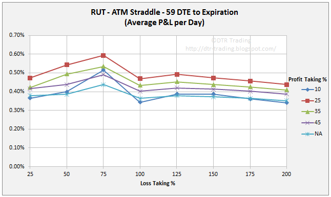
At 59 DTE, the 10% profit taking level really slips behind, with the 25% and 35% profit taking levels showing the greatest P&L per day readings.  The loss taking levels show a clear pattern here...as losses are increased from 25%, to 50%, to 75%, P&L per day readings increase for all of the profit taking levels.  At 59 DTE, don't set your loss threshold greater than 75%...your P&L per day numbers drop off rapidly after this loss level.

66 DTE
66 DTE RUT Short Straddle Summary Normalized Percent P&L Per Day Graph
(click to enlarge)
At 66 DTE, the 50% loss taking level has only slightly lower P&L per day readings than the 75% loss taking level for the four top performers.  There is a clear trend of increasing P&L per day readings as the loss levels are increase from 25%, to 50%, to 75%.  At 66 DTE, the top profit taking levels are 35% and 45%.  As with the 59 DTE variations, don't set your loss level greater than 75% for the 66 DTE variations.

73 DTE
73 DTE RUT Short Straddle Summary Normalized Percent P&L Per Day Graph
(click to enlarge)
At 73 DTE, we can maximize our P&L per day by using a 10% profit taking level and a 50% loss taking level.  The maximum P&L per day value for the 25% profit taking level also occurs with a 50% loss taking level.  The other profit taking variation all see a maximum P&L per day value at the 75% loss taking level.

80 DTE
80 DTE RUT Short Straddle Summary Normalized Percent P&L Per Day Graph
(click to enlarge)
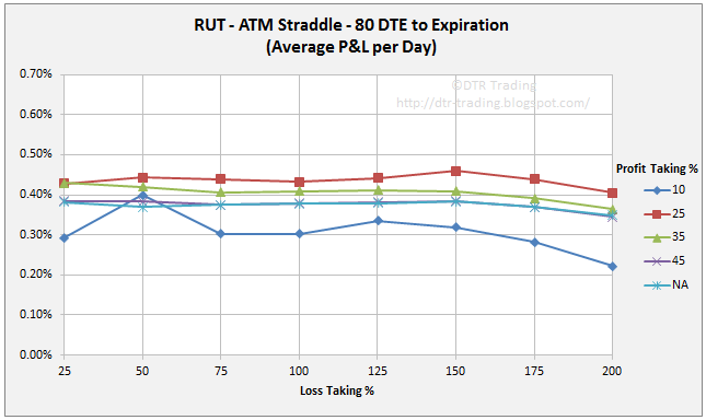
At 80 DTE the P&L per day readings for a given profit taking level do not change too much with different loss taking levels...the lines are fairly flat...except for the 10% profit taking line.  For the 80 DTE variations, you might want to set your loss level at 25%, since it seems that there is not much of an increase in P&L per day if you let your losses expand beyond this point.  At 80 DTE, the 25% profit taking level was the top performer.

----

The next set of charts contains the average normalized P&L per trade for the seven different DTE reviewed in my RUT straddle backtest series.  The different initial PM requirements were used when calculating the P&L per trade numbers similar to how the PM was used in calculating the P&L per day numbers.  Also, as above, the next seven charts use the same Y-axis scale...now to the charts.

38 DTE
38 DTE RUT Short Straddle Summary Normalized Percent P&L Per Trade Graph
(click to enlarge)
The greatest P&L per trade numbers were associated with the variations that carried trades to expiration (NA) rather than using a profit taking target.  The greatest P&L per trade value for the 10% profit taking variations occurred at the 25% loss level.  The other variations had their greatest P&L per trade values at the 100% loss level.

45 DTE
45 DTE RUT Short Straddle Summary Normalized Percent P&L Per Trade Graph
(click to enlarge)
If you choose to trade at 45 DTE, the magic loss taking level is 75%...taking a greater loss than this does not increase your P&L per trade.

52 DTE
52 DTE RUT Short Straddle Summary Normalized Percent P&L Per Trade Graph
(click to enlarge)
At 52 DTE, you pretty much hit your max P&L per trade numbers at the 50% loss taking level.  P&L per trade increases as you increase the profit taking percentage from 10% to expiration (NA).

59 DTE
59 DTE RUT Short Straddle Summary Normalized Percent P&L Per Trade Graph
(click to enlarge)
At 59 DTE, there is a clear trend of increasing P&L per trade as you increase the loss taking level from 25%, to 50%, to 75%...with a drop in P&L per trade as you increase the loss taking level above this point.

66 DTE
66 DTE RUT Short Straddle Summary Normalized Percent P&L Per Trade Graph
(click to enlarge)
P&L per trade numbers are still greater at 66 DTE than at shorter DTE levels.  At 66 DTE, profit taking at 45% showed the highest returns.  We continue to see the trend of increasing P&L per trade as the loss taking levels are increased up to 75%.  No reason to use a loss level of greater than 75%, since there are lower per trade returns after this point.

73 DTE
73 DTE RUT Short Straddle Summary Normalized Percent P&L Per Trade Graph
(click to enlarge)
At 73 DTE, the loss taking levels of NA, 45%, and 35% are clustered together, and reach a maximum P&L per trade at the 75% loss taking level.  For the 25% and 10% profit taking levels, the maximum P&L per trade values occur at the 50% loss taking level.

80 DTE
80 DTE RUT Short Straddle Summary Normalized Percent P&L Per Trade Graph
(click to enlarge)
Up until this point, P&L per trade has been increasing with DTE.  But at 80 DTE, the maximum returns per trade are lower for profit taking levels above 10%.  Also, at 80 DTE we do not see the peak returns occur at the 75% loss taking level...the returns per trade continue increasing all the way to the 150% loss taking level...except for the 10% profit taking level.  The 10% profit taking level showed maximum per trade returns at the 50% loss taking level at both 73 DTE and 80 DTE.

For most of the charts, the 10 percent profit taking level and the 25% loss almost always yielded a return of 5% on the PM requirement...and the PM requirement becomes smaller as we move out in DTE.  So, 5% at 38 DTE is going to be a greater dollar amount than 5% at 80 DTE.  I thought the data around the 10% profit taking level was interesting.

When we are actually trading these straddles, not just analyzing the data, we need to consider effective capital utilization.  Let's look at a quick example:
  • Profit taking at the 10 % level will generally have your DIT at about 30% of DTE.  So, for a 38 DTE trade we can expect to be in the trade for approximately 11 days, while an 80 DTE trade would last approximately 24 days to hit the same 10% profit taking level.
  • For the 10% profit taking level, using a 25% loss target, will yield approximately a 5% return on PM at both 38 DTE and 80 DTE...but the 5% number will be a larger dollar value at 38 DTE than at 80 DTE.
  • This is a slightly contrived example, but it illustrates how to consider applying the data in my blog posts to your trading.

When we consider profit taking targets we need to consider how these targets impact DIT.  Here are a few approximations that seem to hold with RUT straddles:
  • The 10% profit taking level will have your DIT at approximately 30% of DTE
  • The 25% profit taking level will have your DIT at approximately 60% of DTE
  • The 35% profit taking level will have your DIT at approximately 70% of DTE
  • The 45% profit taking level will have your DIT at approximately 80% of DTE

Don't forget, that as the profit taking level is increased, the win rate drops.  See my RUT Straddle Summary Page for links to all of the articles in the series.  Lastly, over the next several days I will tweet (@DTRTrading) win rate line-charts and DIT line-charts, similar to those above.


Follow my blog by email, RSS feed or Twitter (@DTRTrading).  All options are available on the top of the right hand navigation column under the headings "Subscribe To RSS Feed", "Follow By Email", and "Twitter".